Breaking Down the Warriors' 2019-2020 Courts and Uniforms
The Warriors’ new uniforms and court designs have a little bit of everything. But most importantly, they strike a balance between their old home of Oakland and their new home of San Francisco.


When the team announced their relocation across the Bay for the 2019-2020 NBA season, a wide number of questions arose concerning various aspects of the move. People discussed everything from arena construction to ticket sales to in-arena experience. But one of the more minor details still up in the air was how the uniforms and courts would be different once the change of residence was official. Would there be a dramatic overhaul or would there only be minor tweaks? Would they pay tribute to their previous history in San Francisco or would they start entirely anew? Would there be any sort of tribute to the town that the Warriors called home for 47 seasons?
With the releases and/or leaks of the logos, jerseys and hardwood, we have our answers. Although not all of the alterations work, all of them are minor and that is a positive (more on this later).
However, the biggest positive is the acknowledgement of the locations that have made the franchise what it is. Not just San Francisco, not just Oakland, but the entire Bay Area.
The most concrete example of this occurs with their new alternate uniform, a gold look reading “The Bay” across the chest. The Warriors have put these words on several jerseys now, which is great to see. It comes with the recognition of their importance throughout the area. In a place with warring fandoms over two football teams and two baseball teams, they provide unity as the region’s only basketball team(Sacramento is not located in the Bay Area). They are the franchise that Oaklanders, San Franciscans and everyone else in the Bay Area can unite around and they’re smartly leaning into that fact.
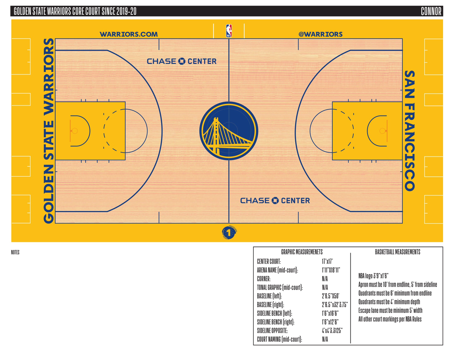
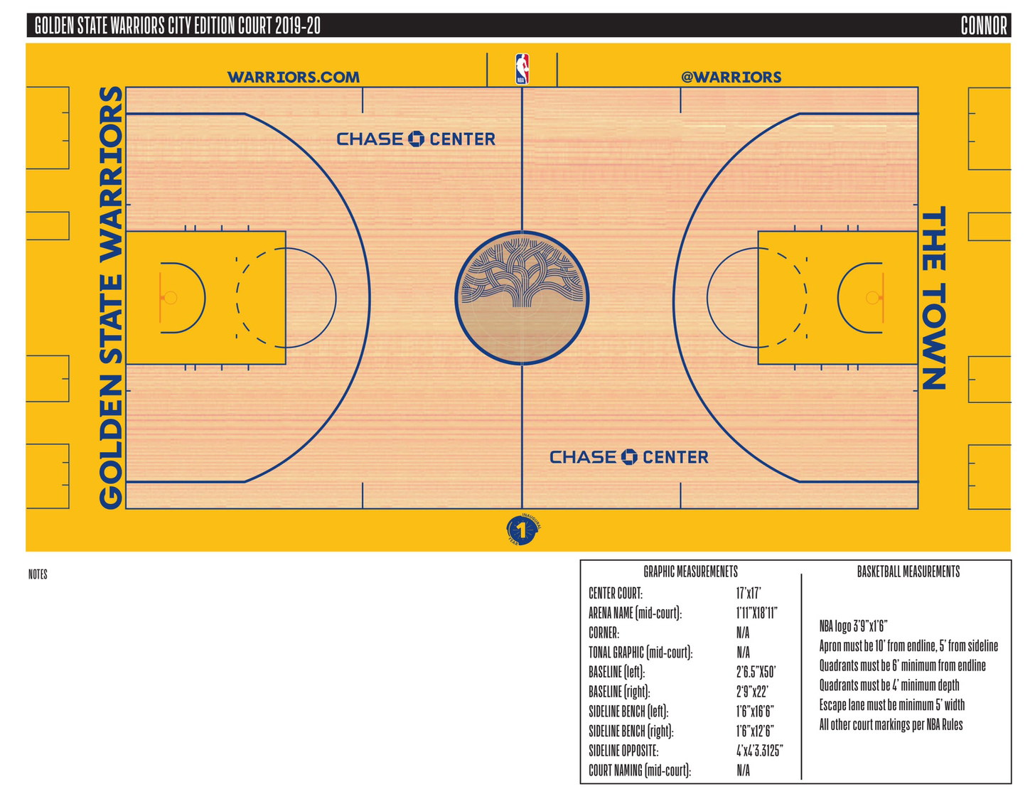
They go even further on this with uniforms and courts that acknowledge Oakland and San Francisco specifically. For the San Francisco side of things, they bring back the legendary “The City” jerseys. Not only are these some of the best threads in NBA history, but they also pay tribute to the team’s time as the San Francisco Warriors in the 1960s and early 70s. Similarly, a white jersey reading “San Francisco” in gold lettering will reportedly make an appearance. These succeed in capturing the Wilt Chamberlain era of the Warriors while also vastly improving on the very similar yellow jerseys they wore as a throwback during Stephen Curry’s early days with the team. Furthermore, three of the four revealed court designs feature the name of the team’s new home city on one of the baselines. The other court pays tribute to Oakland, also via the baseline. But it refuses to say that city’s name, going with “The Town” instead. This has turned into a recurring problem for the team’s Oakland fanbase.
Maybe the Warriors don’t like to be associated with Oakland and prefer the more flashy San Francisco. Whatever the reason may be, the team has constantly slapped San Francisco-related logos and lettering on all kinds of merchandise. At the same time, Oakland has struggled to work its way into the picture. That has turned around somewhat in recent years. The recent “Town” jerseys and tree logo have helped, but Oakland still feels like a second fiddle. The team has never been the Oakland Warriors and “OAK” lettering is nowhere to be found while “SF” showed up frequently, even when the team called Oakland home. So it would have been nice to see the actual word “Oakland” somewhere in the new duds.
With that being said, it would have been very easy for the Warriors to decide to start anew when moving to San Francisco. They could have cut The Town out of the picture entirely. When factoring this in, you have to consider the Oakland recognition a success. The Warriors chose correctly to hold on to the Oakland history and in turn paid solid homage to their longest-tenured city.
The most notable lowlights of the new aesthetics, surprisingly, come with the standard Bay Bridge-based logo and uniforms that the team has been wearing since 2010. Now back to the aforementioned alterations that don’t work. For the move, the font of the standard white and blue jerseys was changed noticeably and the colors were changed slightly. Those changes prove to be a downgrade from the previous edition.
But that downgrade is not a major concern by any stretch of the imagination. What’s far more important is the stuff that works. The uniforms worn by the Warriors at the time of their departure from Oakland were some of the best in franchise history. In choosing to keep them, they’ve held on to the history of a journey that has taken them to courts all over the Bay Area and engineered a successful redesign.